●目次
このプロジェクトの目的は、Webサイトの基本的なレイアウトを学びながら、トップページを自作できるようになることです。
特に以下のポイントを意識して進めていきます:
- HTML:Webページの骨格を作成し、ページ構造を整理する。
- CSS:レスポンシブデザインを取り入れたスタイルを適用する。
- JavaScript:ダイナミックな要素やインタラクティブな操作を実装する。
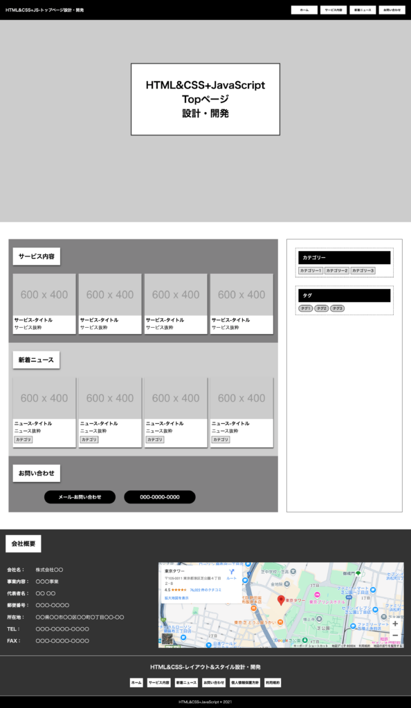
トップページのプレビュー画像
下記のようなトップページをHTML&CSS+JavaScriptを利用して設計開発しましょう!
プロジェクトのディレクトリ構成
プロジェクトのディレクトリ構成を適切に整理することは、効率的な開発を行う上で重要です。
この構成では、HTML、CSS、JavaScript、および画像ファイルを含む資産が適切に分類されています。
これにより、コードの可読性が向上し、メンテナンスが容易になります。
以下はプロジェクトのディレクトリ構成です。
ディレクトリ構成
project-root/
│
├── index.html
├── style.css
│
└── asset/
    ├── css/
    │   ├── reset.css
    │   ├── layout.css
    │   └── component.css
    │
    ├── js/
    │   └── layout.js
    │
└── images/ - index.html:トップページのHTMLファイル。
- style.css:ページ全体のスタイルを定義したファイル。
- reset.css:ブラウザごとのスタイルの違いをリセットするためのCSS。
- layout.css:ページのレイアウトに関連するスタイル。
- component.css:ページのコンポーネントごとのスタイル。
- layout.js:ページの動的要素やインタラクションを制御するJavaScriptファイル。
HTMLのコード
HTMLファイルは、Webページの構造を定義する重要な要素です。このプロジェクトでは、index.htmlがトップページの基盤を形成しています。HTMLの適切なマークアップを使用することで、SEO対策やアクセシビリティの向上が期待できます。
index.html
index.htmlは、ページ全体のレイアウトやコンテンツを管理する中心的なファイルです。
ヘッダー、メインコンテンツ、フッターといったセクションを含むことで、ユーザーが直感的にナビゲートできるように設計されています。
- DOCTYPE宣言
:<!DOCTYPE html>は、HTML5のドキュメントを定義します。 - metaタグ
:charset="UTF-8"は文字エンコーディングを指定し、viewportはレスポンシブデザインに対応するための設定です。 - リンクタグ
:linkタグを使って外部CSSファイルを読み込み、複数のスタイルを適用します。 - ヘッダー
:header要素はナビゲーションメニューとロゴを含みます。 - メインコンテンツ
:main要素の中で、ページの主要なコンテンツを提供します。 - フッター
:footer要素には著作権情報を表示します。
HTML(index.html)
<!DOCTYPE html>
<html lang="ja">
<head>
<meta charset="UTF-8">
<meta name="viewport" content="width=device-width, initial-scale=1.0">
<title>HTML&CSS+JavaScript</title>
<link rel="stylesheet" href="./style.css">
<link rel="stylesheet" href="./asset/css/reset.css">
<link rel="stylesheet" href="./asset/css/layout.css">
<link rel="stylesheet" href="./asset/css/component.css">
</head>
<body>
<header class="header">
<a href="/" class="headerLogo">
HTML&CSS+JS-トップページ設計・開発
</a>
<nav class="headerNav">
<ul>
<li>
<a href="/">ホーム</a>
</li>
<li>
<a href="/service">サービス内容</a>
</li>
<li>
<a href="/news">新着ニュース</a>
</li>
<li>
<a href="/contact">お問い合わせ</a>
</li>
</ul>
</nav>
</header>
<div class="wrapper">
<div class="cover--top">
<div class="coverBox">
<h1 class="heading01 top">
HTML&CSS+JavaScript<br>Topページ<br>設計・開発
</h1>
</div>
</div>
<div class="container col_1_2">
<main class="main">
<section class="sections">
<section class="section">
<h2 class="heading02">サービス内容</h2>
<div class="sectionContent">
<ul class="postList">
<li class="postItem">
<a class="postItemLink" href="/service/サービス-タイトル" >
<img src="/asset/images/600x400.png" alt="サービス-タイトル画像">
</a>
<div class="postItemInfoWapper">
<div class="postItemInfoContainer">
<h3 class="heading03">
<a class="postItemLink" href="/service/サービス-タイトル">
サービス-タイトル
</a>
</h3>
</div>
<div class="postItemInfoContainer">
<p class="lead03">サービス抜粋</p>
</div>
</div>
</li>
</ul>
</div>
</section>
<section class="section">
<h2 class="heading02">新着ニュース</h2>
<div class="sectionContent">
<ul class="postList">
<li class="postItem">
<a class="postItemLink" href="/service/ニュース-タイトル" >
<img src="/asset/images/600x400.png" alt="ニュース-タイトル画像">
</a>
<div class="postItemInfoWapper">
<div class="postItemInfoContainer">
<h3 class="heading03">
<a class="postItemLink" href="/service/ニュース-タイトル">
ニュース-タイトル
</a>
</h3>
</div>
<div class="postItemInfoContainer">
<p class="lead03">ニュース抜粋</p>
</div>
<div class="postItemInfoContainer">
<nav class="categoryNav">
<ul>
<li>
<a href="/service/category/カテゴリ名">カテゴリ</a>
</li>
</ul>
</nav>
</div>
</div>
</li>
</ul>
</div>
</section>
<section class="section">
<h2 class="heading02">お問い合わせ</h2>
<div class="sectionContent">
<div class="btnGroup">
<a href="" class="btn">
メール-お問い合わせ
</a>
<a href="tel:000-0000-0000" class="btn">
000-0000-0000
</a>
</div>
</div>
</section>
</section>
</main>
<aside class="side">
<div class="sideBox">
<h4 class="heading04">カテゴリー</h4>
<nav class="categoryNav">
<ul>
<li>
<a href="">カテゴリー1</a>
</li>
<li>
<a href="">カテゴリー2</a>
</li>
<li>
<a href="">カテゴリー3</a>
</li>
</ul>
</nav>
</div>
<div class="sideBox">
<h4 class="heading04">タグ</h4>
<nav class="tagNav">
<ul>
<li>
<a href="">タグ1</a>
</li>
<li>
<a href="">タグ2</a>
</li>
<li>
<a href="">タグ3</a>
</li>
</ul>
</nav>
</div>
</aside>
</div>
</div>
<footer class="footer">
<section class="footerSection">
<h2 class="heading02">
会社概要
</h2>
<div class="footerSectionContent">
<table class="companyTable">
<tbody>
<tr>
<th>会社名:</th>
<td>株式会社〇〇</td>
</tr>
<tr>
<th>事業内容:</th>
<td>〇〇〇事業</td>
</tr>
<tr>
<th>代表者名:</th>
<td>〇〇 〇〇</td>
</tr>
<tr>
<th>郵便番号:</th>
<td>〇〇〇-〇〇〇〇</td>
</tr>
<tr>
<th>所在地:</th>
<td>〇〇県〇〇市〇〇区〇〇町〇丁目〇〇-〇〇</td>
</tr>
<th>TEL:</th>
<td>〇〇〇-〇〇〇〇-〇〇〇〇</td>
</tr>
<tr>
<th>FAX:</th>
<td>〇〇〇-〇〇〇〇-〇〇〇〇</td>
</tr>
</tbody>
</table>
<div class="gMap">
<iframe src="https://www.google.com/maps/embed?pb=!1m18!1m12!1m3!1d3241.7479757770916!2d139.74285797578673!3d35.658580472594515!2m3!1f0!2f0!3f0!3m2!1i1024!2i768!4f13.1!3m3!1m2!1s0x60188bbd9009ec09%3A0x481a93f0d2a409dd!2z5p2x5Lqs44K_44Ov44O8!5e0!3m2!1sja!2sjp!4v1724937346041!5m2!1sja!2sjp" allowfullscreen="" loading="lazy" referrerpolicy="no-referrer-when-downgrade"></iframe>
</div>
</div>
</section>
<div class="footerMenu">
<a href="/" class="footerLogo">
HTML&CSS-レイアウト&スタイル設計・開発
</a>
<nav class="footerNav">
<ul>
<li>
<a href="/">ホーム</a>
</li>
<li>
<a href="/service">サービス内容</a>
</li>
<li>
<a href="/news">新着ニュース</a>
</li>
<li>
<a href="/contact">お問い合わせ</a>
</li>
<li>
<a href="/privacy-policy">個人情報保護方針</a>
</li>
<li>
<a href="/term-of-use">利用規約</a>
</li>
</ul>
</nav>
</div>
<div class="footerBar">
<p>
<small>HTML&CSS+JavaScript © 2021</small>
</p>
</div>
</footer>
<script src="./asset/js/layout.js"></script>
</body>
</html>
CSSのコード
style.css
CSS(style.css)
/*
Theme Name: Roa run dev Custom Theme
Description: 日本の開発チーム「Roa run dev」によって開発されたカスタムテーマです。
Version: 1.0.0
Author: Roa run dev Team
Author URI: https://roa-run-dev.com
Text Domain: roa-run-dev-theme

-------------------------
Developer Information
-------------------------
Developed by: Roa run dev
Location: Japan
Website: https://roa-run-dev.com
Date: 2024-08-25

Additional Notes:
- このスタイルシートは、Roa run devプロジェクト向けに作成された独自のスタイルを定義しています。
- カスタムCSSは、Roa run devのデザイン原則に従って記述してください。
*/
reset.css
reset.cssは、ブラウザ間で異なるデフォルトのスタイルをリセットし、より一貫した表示を提供します。
これにより、プロジェクト全体で予測可能なスタイリングを実現できます。
CSS(reset.css)
@charset "utf-8";

html, body, div, span, applet, object, iframe,
h1, h2, h3, h4, h5, h6, p, blockquote, pre,
a, abbr, acronym, address, big, cite, code,
del, dfn, em, img, ins, kbd, q, s, samp,
small, strike, strong, sub, sup, tt, var,
b, u, i, center,
dl, dt, dd, ol, ul, li,
fieldset, form, label, legend,
table, caption, tbody, tfoot, thead, tr, th, td,
article, aside, canvas, details, embed,
figure, figcaption, footer, header, hgroup,
menu, nav, output, ruby, section, summary,
time, mark, audio, video {
    margin: 0;
    padding: 0;
    border: 0;
    font-size: 100%;
    font: inherit;
    vertical-align: baseline;
}

/* HTML5 display-role reset for older browsers */
article, aside, details, figcaption, figure,
footer, header, hgroup, menu, nav, section {
    display: block;
}

body {
    line-height: 1;
}

ol, ul {
    list-style: none;
}

blockquote, q {
    quotes: none;
}

blockquote:before, blockquote:after,
q:before, q:after {
    content: '';
    content: none;
}

table {
    border-collapse: collapse;
    border-spacing: 0;
}

/* 全ての要素にボックスサイズを設定 */
* {
    box-sizing: border-box;
}

/* リンクの下線をリセット */
a {
    text-decoration: none;
    color: inherit;
}

/* イメージの最大幅を100%に設定 */
img {
    max-width: 100%;
    height: auto;
    display: block;
}

/* フォーム要素のスタイルリセット */
button, input, select, textarea {
    font: inherit;
    margin: 0;
}

/* ボタンのスタイルリセット */
button {
    background: none;
    border: none;
    padding: 0;
    cursor: pointer;
}

/* HTML5追加要素の初期化 */
address, fieldset, legend, hr {
    display: block;
}
layout.css
layout.cssは、ページ全体のレイアウトを定義します。
ここでは、ページ全体の構造を決定するスタイルを指定しています。
- body
- header
- footer
- wrapper
- cover
- container
- main, section
- side
CSS(layout.css)
@charset "utf-8";

/* >>>>>>>>>>>>>>>>>>>>>>>>>>>>>>>
  body
>>>>>>>>>>>>>>>>>>>>>>>>>>>>>>> */
body {
  max-width: 1920px;
  width: 100%;
  margin: 0 auto;
}

/* >>>>>>>>>>>>>>>>>>>>>>>>>>>>>>>
  header
>>>>>>>>>>>>>>>>>>>>>>>>>>>>>>> */
.header {
  z-index: 999;
  position: fixed;
    top: 0;
    right: 0;
    left: 0;
  display: flex;
    flex-direction: column;
    justify-content: space-between;
    align-items: center;
    gap: 10px;
  max-width: 1920px;
  width: 100%;
  padding: 8px 5px;
  margin: 0 auto;
  background-color: black;
  color: #fff;
}
.headerLogo {
  display: block;
  font-size: 12px;
  font-weight: 700;
}
.headerNav {
  max-width: 400px;
  width: 100%;
}
.headerNav ul {
  display: flex;
    gap: 10px;
  width: 100%;
}
.headerNav ul li {
  width: calc( 1 / 4 * 100%);
	text-align: center;
}
.headerNav ul li a {
  display: block;
  padding: 8px 5px;
  background-color: #fff;
  color: #000;
  font-size: 10px;
  font-weight: 600;
}
.headerNav ul li a:hover {
  background-color: #333;
  color: #ccc;
}
/*★★★min-width 768★★★*/
@media screen and (min-width: 768px) {
  .header {
    flex-direction: row;
    padding: 15px;
  }
  .headerLogo {
    font-size: 14px;
  }
  .headerNav ul li a {
    padding: 10px;
  }
}
/*★★★min-width 1020★★★*/
@media screen and (min-width: 1020px) {
  .header {
    padding: 20px;
  }
}

/* >>>>>>>>>>>>>>>>>>>>>>>>>>>>>>>
  wrapper
>>>>>>>>>>>>>>>>>>>>>>>>>>>>>>> */
.wrapper {
}

/* >>>>>>>>>>>>>>>>>>>>>>>>>>>>>>>
  cover
>>>>>>>>>>>>>>>>>>>>>>>>>>>>>>> */
.cover--top {
  display: flex;
  justify-content: center;
  align-items: center;
  height: 100vh;
  background-color: #ccc;
}
.cover--top h1 {
  font-size: 18px;
  line-height: 1.25em;
  padding: 5px;
  text-align: center;
}

/* >>>>>>>>>>>>>>>>>>>>>>>>>>>>>>>
  container
>>>>>>>>>>>>>>>>>>>>>>>>>>>>>>> */
.container {
  width: 100%;
  padding: 30px;
  margin: 30px auto;
}
.container.col_1_2 {
  display: flex;
  flex-direction: column;
  gap: 30px;
}
.container.col_1_2 .main {
  width: 100%;
}
.container.col_1_2 .side {
  width: 100%;
}
/*★★★min-width 768★★★*/
@media screen and (min-width: 768px) {
  .container.col_1_2 {
    display: flex;
    flex-direction: row;
  }
  .container.col_1_2 .main {
    width: 70%;
  }
  .container.col_1_2 .side {
    width: 30%;
  }
}

/* >>>>>>>>>>>>>>>>>>>>>>>>>>>>>>>
  main, section
>>>>>>>>>>>>>>>>>>>>>>>>>>>>>>> */
.main {

}
.section {
  padding: 15px;
}
.sections .section:nth-of-type(odd) {
  background-color: rgba(5, 5, 5, 0.5);
}
.sections .section:nth-of-type(even) {
  background-color: rgba(10, 10, 10, 0.2);
}

/*★★★min-width 768★★★*/
@media screen and (min-width: 768px) {
  .section {
    padding: 30px 15px;
  }
}

/* >>>>>>>>>>>>>>>>>>>>>>>>>>>>>>>
  side
>>>>>>>>>>>>>>>>>>>>>>>>>>>>>>> */
.side {
  display: flex;
  flex-direction: column;
  gap: 10px;
  border: 1px solid #333;
  padding: 10px;
  padding-top: 15px;
}
.sideBox {
  border: 1px dashed #333;
  padding: 10px;
}
/*★★★min-width 768★★★*/
@media screen and (min-width: 768px) {
  .side {
    gap: 30px;
    padding: 30px;
  }
}

/* >>>>>>>>>>>>>>>>>>>>>>>>>>>>>>>
  footer
>>>>>>>>>>>>>>>>>>>>>>>>>>>>>>> */
.footer {
  background-color: #333;
  color: #fff;
  /* padding: 10px; */
}
.footerSection {
  padding: 20px;
}
.footerSectionContent {
  display: flex;
  flex-direction: column;
  gap: 30px;
  padding: 5px;
}
.footerMenu {
  display: flex;
  flex-direction: column;
  gap: 30px;
  border-top: 1px solid #fff;
  padding: 15px;
}
.footerLogo {
  text-align: center;
  font-weight: 600;
  font-size: 18px;
}
.footerNav {
}
.footerNav ul {
  display: flex;
  flex-direction: row;
  justify-content: center;
  align-items: center;
  flex-wrap: wrap;
  gap: 15px;
}
.footerNav ul li {
  display: flex;
}
.footerNav ul li a {
  padding: 10px 5px;
  background-color: #fff;
  color: #000;
  font-size: 12px;
  font-weight: 600;
}
.footerNav ul li a:hover {
  background-color: #000;
  color: #fff;
}
.footerBar {
  padding: 15px;
  border-top: 1px solid #fff;
  background-color: #000;
}
.footerBar p  {
  text-align: center;
  font-size: 12px;
}
/*★★★min-width 768★★★*/
@media screen and (min-width: 768px) {
  .footerMenu {
    padding: 30px;
  }
}
/*★★★min-width 1020★★★*/
@media screen and (min-width: 1020px) {
  .footerSectionContent {
    flex-direction: row;
    align-items: center;
    gap: 30px;
  }
}
component.css
component.cssは、ページ内の特定のコンポーネントのスタイリングを管理します。
これにより、ページのビジュアルアイデンティティが確立されます。
- 段落
- 見出し
- ボタン, リンク
- ナビ
- リスト, アイテム
- テーブル(表)
- マップ
CSS(component.css)
@charset "utf-8";

/* >>>>>>>>>>>>>>>>>>>>>>>>>>>>>>>>>>
  段落
>>>>>>>>>>>>>>>>>>>>>>>>>>>>>>>>>>>>> */
.paragraph {

}

/* >>>>>>>>>>>>>>>>>>>>>>>>>>>>>>>>>>
  見出し1
>>>>>>>>>>>>>>>>>>>>>>>>>>>>>>>>>>>>> */
.heading01 {
  font-weight: 700;
}
.heading01.top {
  font-size: 21px;
  line-height: 1.5em;
  padding: 15px;
  border: 3px solid #333;
  box-shadow: 1px 2px 3px #ccc;
  text-align: center;
  transform: translateY(-50%);
  background-color: #fff;
}
/*★★★min-width 768★★★*/
@media screen and (min-width: 768px) {
  .heading01.top {
    font-size: 26px;
    padding: 30px;
    transform: translateY(-40%);
  }
}
/*★★★min-width 1020★★★*/
@media screen and (min-width: 1020px) {
  .heading01.top {
    font-size: 33px;
    padding: 50px;
    transform: translateY(-30%);
  }
}

/* >>>>>>>>>>>>>>>>>>>>>>>>>>>>>>>>>>
  見出し2
>>>>>>>>>>>>>>>>>>>>>>>>>>>>>>>>>>>>> */
.heading02 {
  display: inline-block;
  font-weight: 600;
}
.heading02 {
  background-color: #fff;
  color: #000;
  padding: 15px;
  margin-bottom: 15px;
  box-shadow: 1px 3px 5px #333;
  font-size: 16px;
}
/*★★★min-width 768★★★*/
@media screen and (min-width: 768px) {
  .heading02 {
    margin-bottom: 30px;
    font-size: 18px;
    padding: 20px;
  }
}
/*★★★min-width 1020★★★*/
@media screen and (min-width: 1020px) {
  .heading02 {
    font-size: 21px;
  }
}
.lead02 {
  padding: 10px;
}

/* >>>>>>>>>>>>>>>>>>>>>>>>>>>>>>>>>>
  見出し3
>>>>>>>>>>>>>>>>>>>>>>>>>>>>>>>>>>>>> */
.heading03 {
  font-weight: 600;
}

/* >>>>>>>>>>>>>>>>>>>>>>>>>>>>>>>>>>
  見出し4
>>>>>>>>>>>>>>>>>>>>>>>>>>>>>>>>>>>>> */
.heading04 {
  background-color: #000;
  color: #fff;
  padding: 15px;
  margin-bottom: 10px;
  font-weight: 600;
}

/* >>>>>>>>>>>>>>>>>>>>>>>>>>>>>>>>>>
  ボタン
>>>>>>>>>>>>>>>>>>>>>>>>>>>>>>>>>>>>> */
.btnGroup {
  display: flex;
  flex-direction: column;
  justify-content: center;
  align-items: center;
  gap: 30px;
  max-width: 750px;
  width:  100%;
}
.btnGroup .btn {
  display: flex;
  justify-content: center;
  align-items: center;
  max-width: 250px;
  width: 100%;
  padding: 15px 10px;
}
.btn {
  border-radius: 30px;
  background-color: #000;
  color: #fff;
  font-weight: 600;
}
.btn:hover {
  background-color: #fff;
  color: #333;
}
/*★★★min-width 768★★★*/
@media screen and (min-width: 768px) {
  .btnGroup {
    flex-direction: row;
  }
  .btnGroup .btn {
    display: flex;
    justify-content: center;
    align-items: center;
  }
}

/* >>>>>>>>>>>>>>>>>>>>>>>>>>>>>>>>>>
  ナビ-カテゴリ
>>>>>>>>>>>>>>>>>>>>>>>>>>>>>>>>>>>>> */
.categoryNav {

}
.categoryNav ul {
  display: flex;
  flex-wrap: wrap;
  gap: 5px;
}
.categoryNav ul li {
  display: flex;
  flex-wrap: wrap;
  flex-direction: column;
  gap: 5px;
}
.categoryNav ul li a {
  display: flex;
  align-items: center;
  justify-content: center;
  background: #e4e4e4;
  border: 1px solid #333;
  color: #333;
  font-weight: 600;
  line-height: 1;
}
.categoryNav ul li a:hover {
  background: #000;
  color: #ccc;
}
@media (min-width: 320px) {
  .categoryNav ul li a {
    width: 100%;
    font-size:  11px;
    padding: 3px 5px;
  }
  .categoryNav ul li ul li a {
    font-size: 10px;
    padding: 3px 5px;
  }
}
@media (min-width: 768px) {
  .categoryNav ul li a {
    font-size: 12px;
  }
  .categoryNav ul li ul li a {
    font-size: 11px;
  }
}
@media (min-width: 1400px) {
  .categoryNav ul li a {
    font-size: 13px;
    padding: 5px;
  }
  .categoryNav ul li ul li a {
    font-size: 12px;
    padding: 5px;
  }
}

/* >>>>>>>>>>>>>>>>>>>>>>>>>>>>>>>>>>
  ナビ-タグ
>>>>>>>>>>>>>>>>>>>>>>>>>>>>>>>>>>>>> */
.tagNav {
}
.tagNav ul {
  display: flex;
  flex-wrap: wrap;
  gap: 5px;
}
.tagNav ul li {
  gap: 5px;
}
.tagNav ul li a {
  display: flex;
  align-items: center;
  justify-content: center;
  background: #ccc;
  border: 1px solid #000;
  border-radius: 20px;
  color: #333;
  font-size: 9px;
  font-weight: 600;
}
.tagNav a:hover {
  background: #333;
  color: #fff;
}
@media (min-width: 320px) {
  .tagNav ul li a {
    font-size: 10px;
    padding: 5px;
  }
}
@media (min-width: 768px) {
  .tagNav ul li a {
    font-size: 10px;
    padding: 5px;
  }
}
@media (min-width: 1024px) {
  .tagNav ul li a {
    font-size: 11px;
  }
}
@media (min-width: 1200px) {
  .tagNav ul li a {
    font-size: 12px;
    padding: 5px 8px;
  }
}

/* >>>>>>>>>>>>>>>>>>>>>>>>>>>>>>>>>>
  ナビ-ページネーション
>>>>>>>>>>>>>>>>>>>>>>>>>>>>>>>>>>>>> */
.paginationNav {

}

/* >>>>>>>>>>>>>>>>>>>>>>>>>>>>>>>>>>
  ナビ-パンくず
>>>>>>>>>>>>>>>>>>>>>>>>>>>>>>>>>>>>> */
.breadcrumbNav {

}

/* >>>>>>>>>>>>>>>>>>>>>>>>>>>>>>>>>>
  ポスト-リスト,アイテム
>>>>>>>>>>>>>>>>>>>>>>>>>>>>>>>>>>>>> */
.postList {
  display: flex;
  flex-direction: row;
  flex-wrap: wrap;
  justify-content: flex-start;
  gap: 10px;
}
.postList .postItem {
  width: calc(100% / 2 - 5px);
  background-color: #fff;
  box-shadow: 1px 3px 3px #333;
}
.postItemLink:hover {
  opacity: .5;
}
.postItemInfoWapper {
  display: flex;
  flex-direction: column;
  gap: 10px;
  padding: 8px 5px 15px;
}
/*★★★min-width 768★★★*/
@media screen and (min-width: 1020px) {
  .postList .postItem {
    width: calc(100% / 4 - 8px);
  }
}

/* >>>>>>>>>>>>>>>>>>>>>>>>>>>>>>>>>>
  テーブル
>>>>>>>>>>>>>>>>>>>>>>>>>>>>>>>>>>>>> */
table.companyTable {
  display: block;
  max-width: 500px;
  width: 100%;
  border-collapse: collapse;
  table-layout: fixed;
  word-wrap: break-word;
}
.companyTable tbody {
  display: flex;
  flex-direction: column;
  gap: 15px;
  width: 100%;
}
.companyTable tbody tr {
  display: flex;
  align-items: center;
  flex-direction: row;
}
.companyTable tbody tr th,
.companyTable tbody tr td {
  text-align: left;
  line-height: 1.35em;
}
.companyTable tbody tr th {
  max-width: 100px;
  width: 30%;
  font-weight: 600;
}
.companyTable tbody tr td {
  width: 70%;
}
/*★★★min-width 1020★★★*/
@media screen and (min-width: 1020px) {
  .companyTable tbody {
    gap: 20px;
  }
}

/* >>>>>>>>>>>>>>>>>>>>>>>>>>>>>>>>>>
  Googleマップ
>>>>>>>>>>>>>>>>>>>>>>>>>>>>>>>>>>>>> */
.gMap {
  width: 100%;
}
.gMap iframe {
  width: 100%;
  height: 300px;
}
JavaScriptのコード
layout.js
ヘッダーの高さを動的に取得し、カバーエリアの高さやメインコンテンツの上部の余白を調整するために使用されます。これにより、異なる画面サイズやウィンドウのリサイズに応じて、ページレイアウトが適切に維持されるようにします。
JavaScript(layout.js)
let headerHeight = 0;

// ヘッダーの高さを更新する関数
function updateHeaderHeight() {
  const header = document.querySelector('header');
  if (header !== null) {
    headerHeight = header.offsetHeight;
  }
}

// カバーエリアの高さを調整する関数
function adjustCoverHeight() {
  const cover = document.querySelector('.cover--top');
  if (cover !== null) {
    cover.style.height = `calc(100vh - ${headerHeight}px)`;
  }
}

// ウィンドウのリサイズイベントに対する処理
window.addEventListener('resize', function() {
  updateHeaderHeight();
  adjustCoverHeight();
  const main = document.querySelector('.wrapper');
  if (main !== null) {
    main.style.paddingTop = `${headerHeight}px`;
  }
});

// ページのロード完了時に実行する処理
window.addEventListener('load', function() {
  updateHeaderHeight();
  adjustCoverHeight();
  const main = document.querySelector('.wrapper');
  if (main !== null) {
    main.style.paddingTop = `${headerHeight}px`;
  }
});